Quote Flow
Role: UX lead/art director and individual contributor (early stages).
Contributors: Kelsey Gallagher, Brad Schnittger.
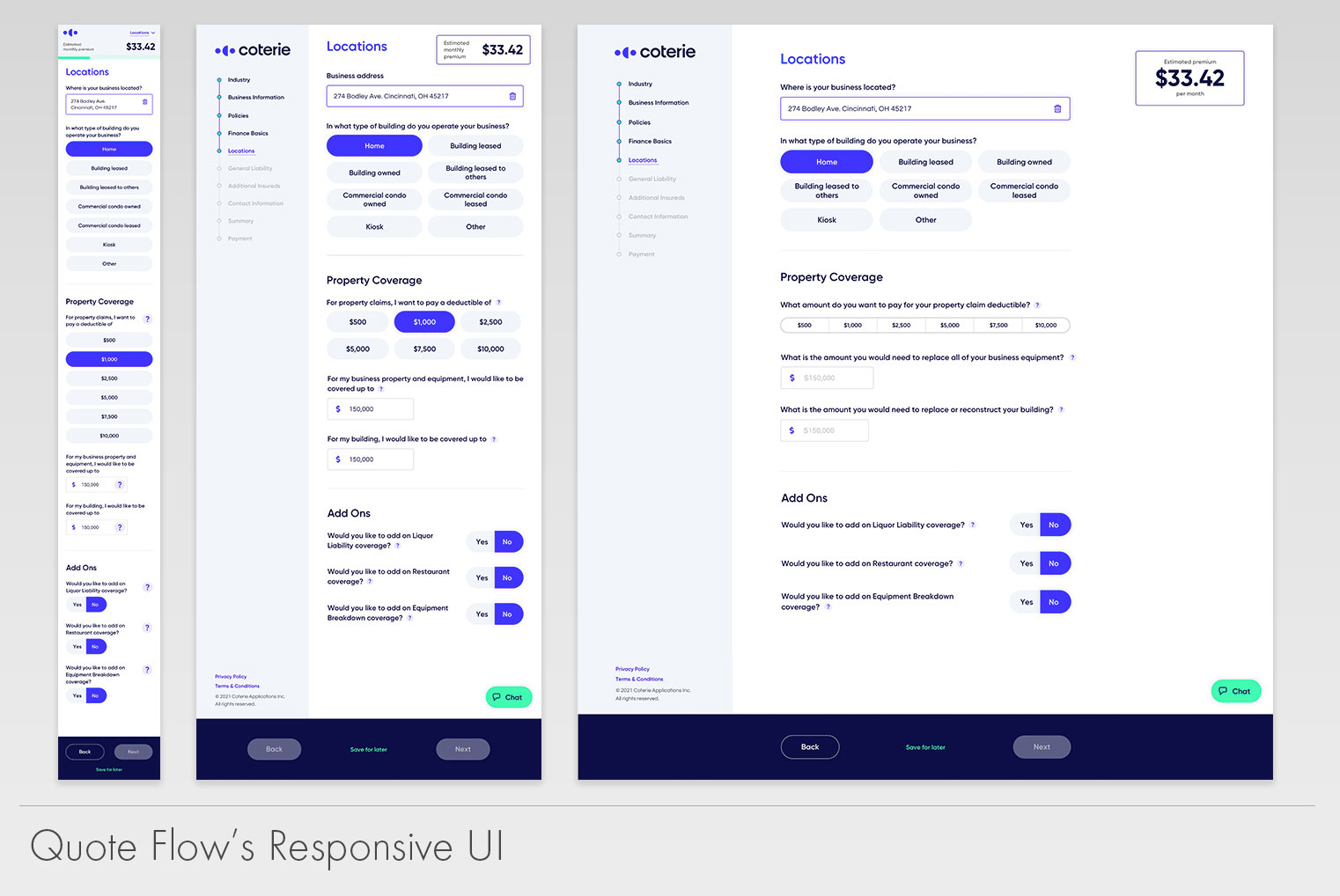
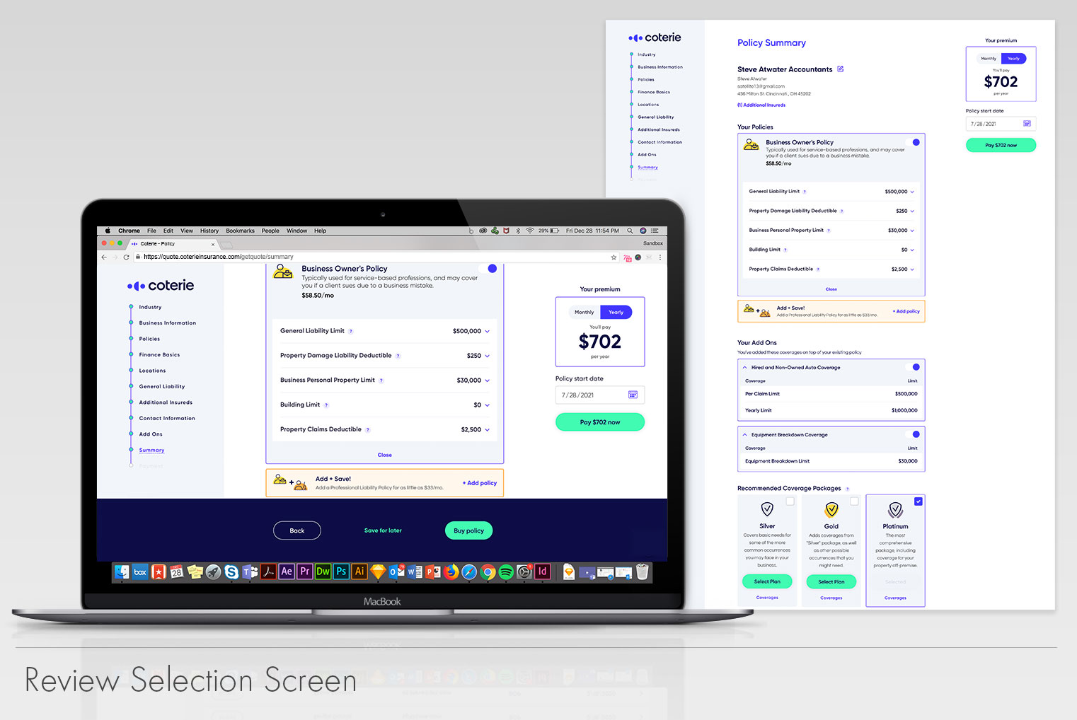
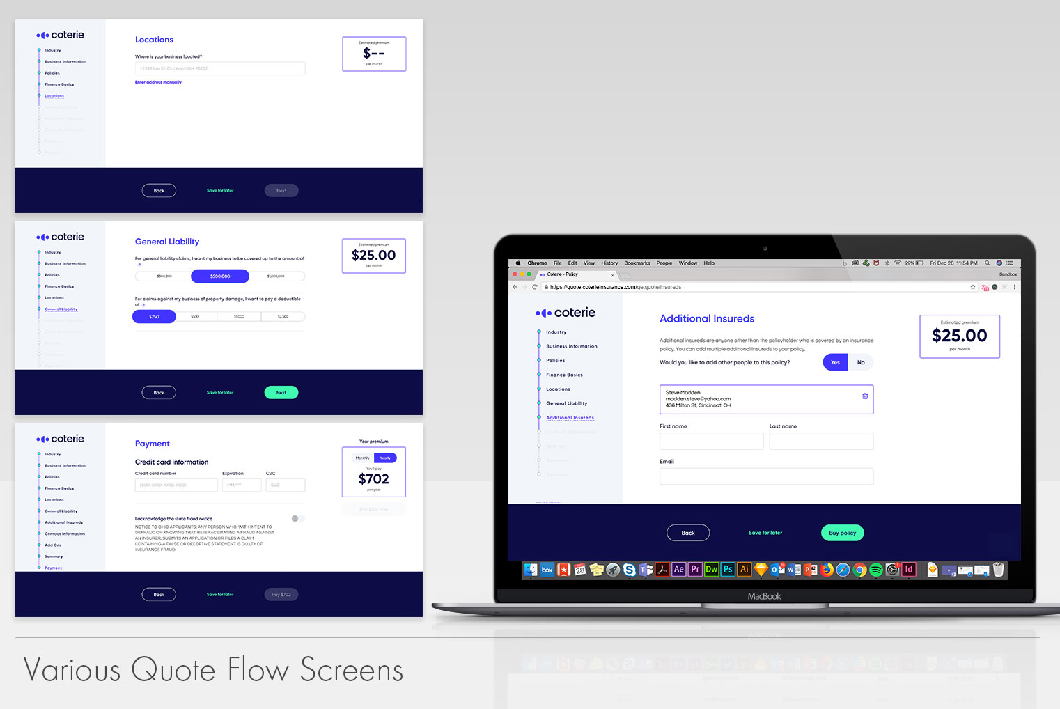
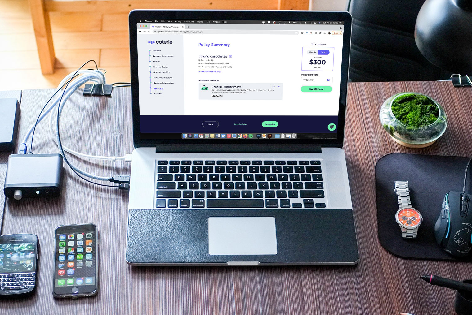
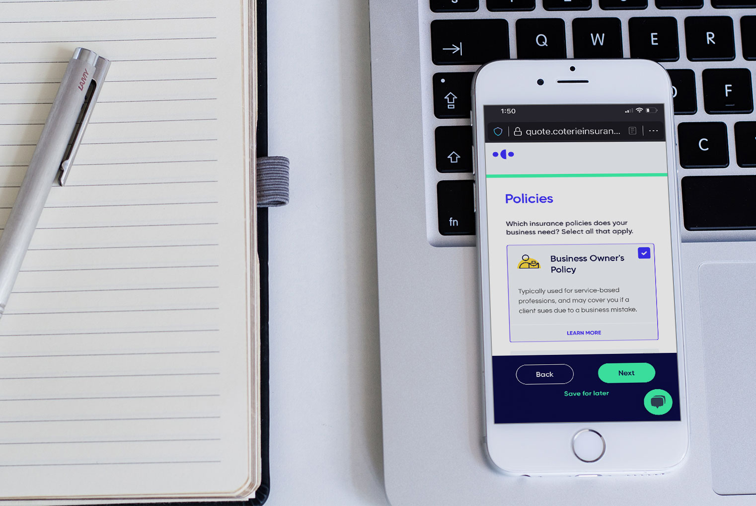
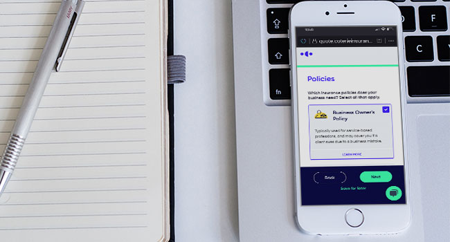
Quote Flow was Coterie’s first digital product that was available to the public. Its purpose is to provide small businesses with a self-service system that could generate a quote in minutes without having to work with an agent. Quote Flow uses the business’ historical data to generate a quote and provide the user with coverage and add-ons suggestions.
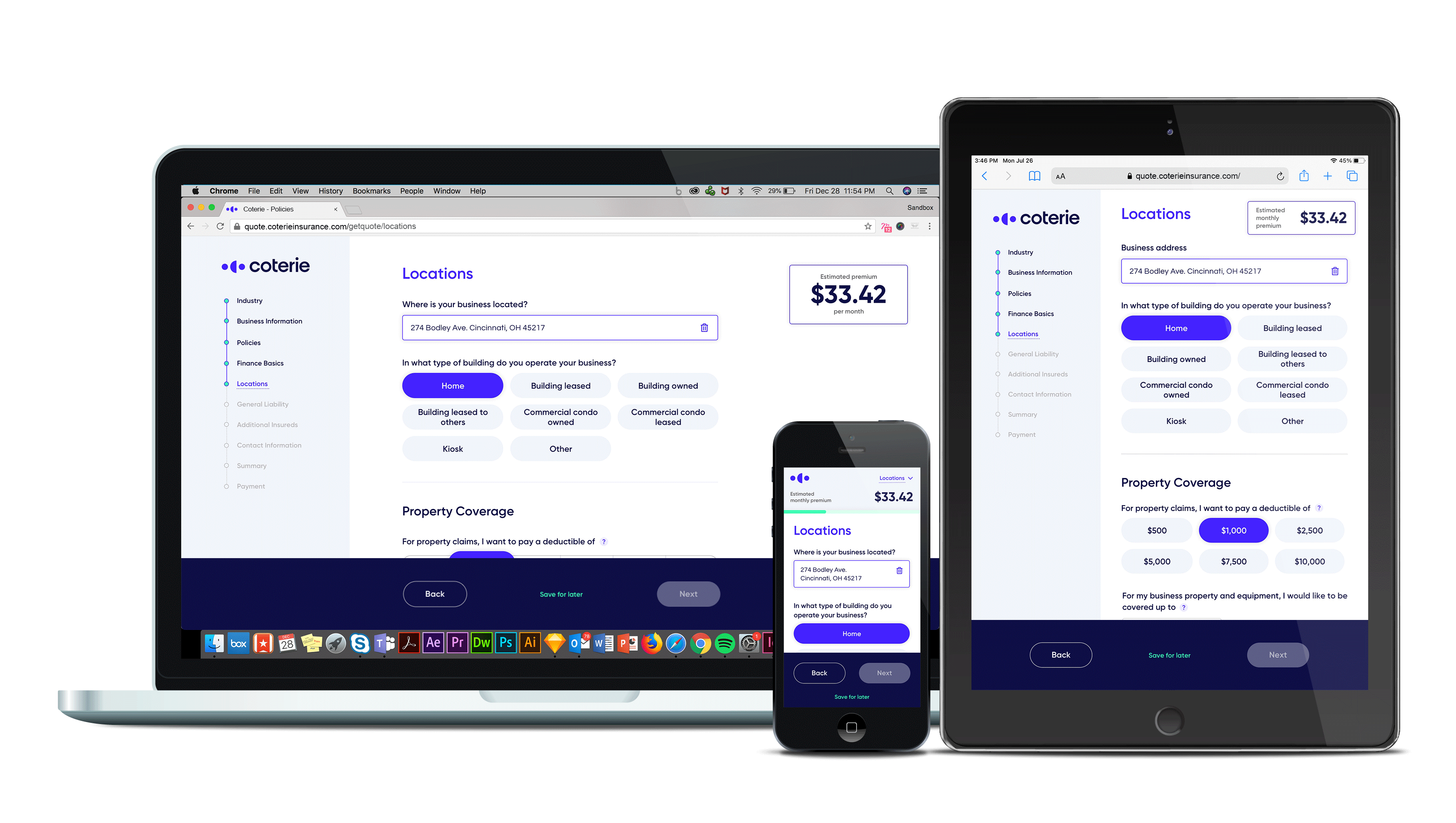
When I joined the team, this platform was steadily adding features; however, it needed a makeover as there were a
lot of inconsistencies throughout the user flow. It had an
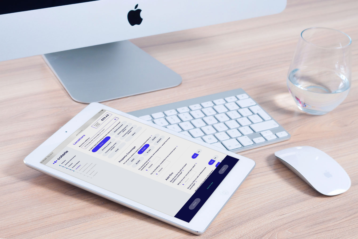
incomplete mobile experience and it needed visual
polishing to reflect the branding better.
The company was starting to gain more visibility and
we needed to improve the overall experience.
For this project, I started as an individual contributor,
however due to time and other priorities I moved into
an art director role. I wasn’t building every element on the page, but rather I was leading how the tool would interact with our users. My team consisted of one full time designer,
a part time designer, a project manager and a small
development team.
Collectively we started building a design system that we could use across all products in the company’s ecosystem. This would be the first of our products to benefit from such system. Our main focus was to make sure we could deliver a consistent experience across all devices and meet
accessibility standards. We reworked some of the language to give Quote Flow a friendlier tone of voice. Modals and
error messages were updated to help the user pinpoint
mistakes or complete missing information. We leveraged analytics to understand where in the process the users were getting stuck and try to address those issues.
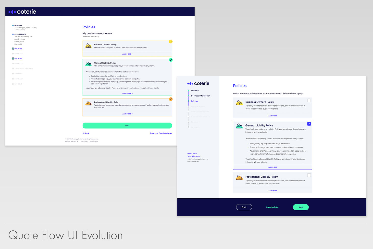
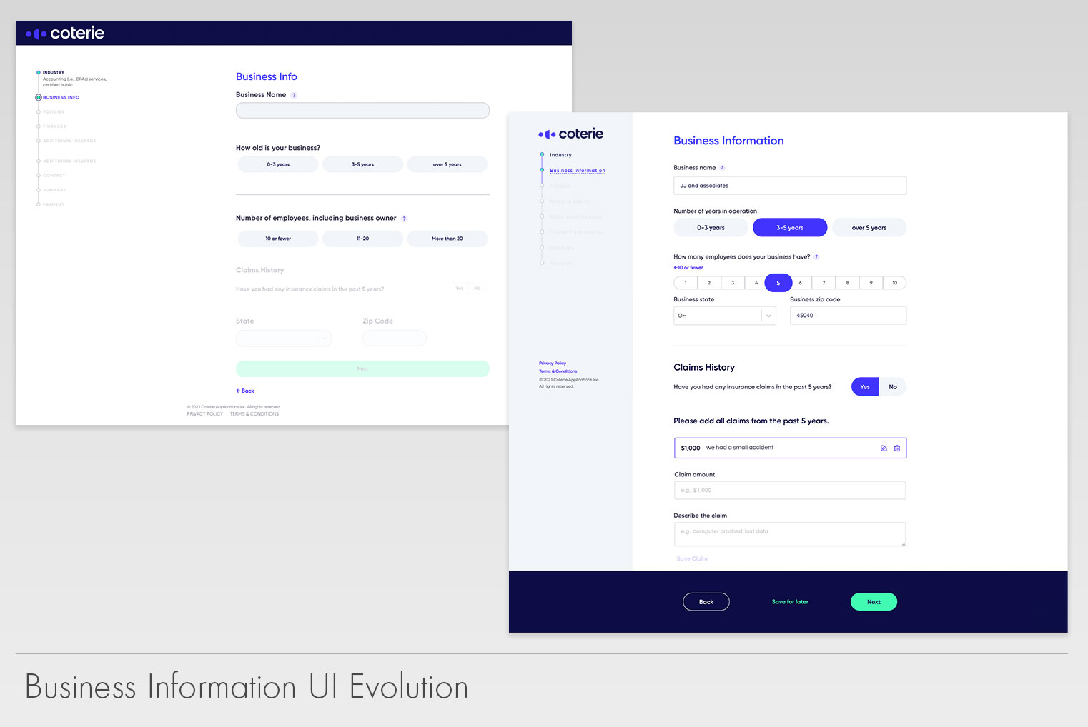
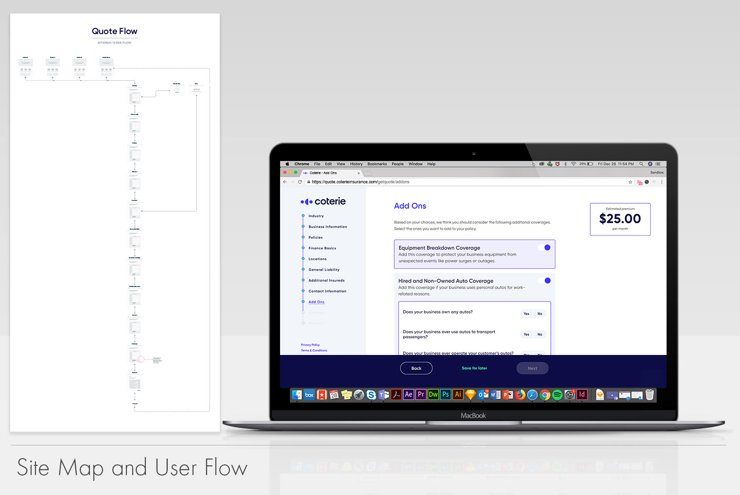
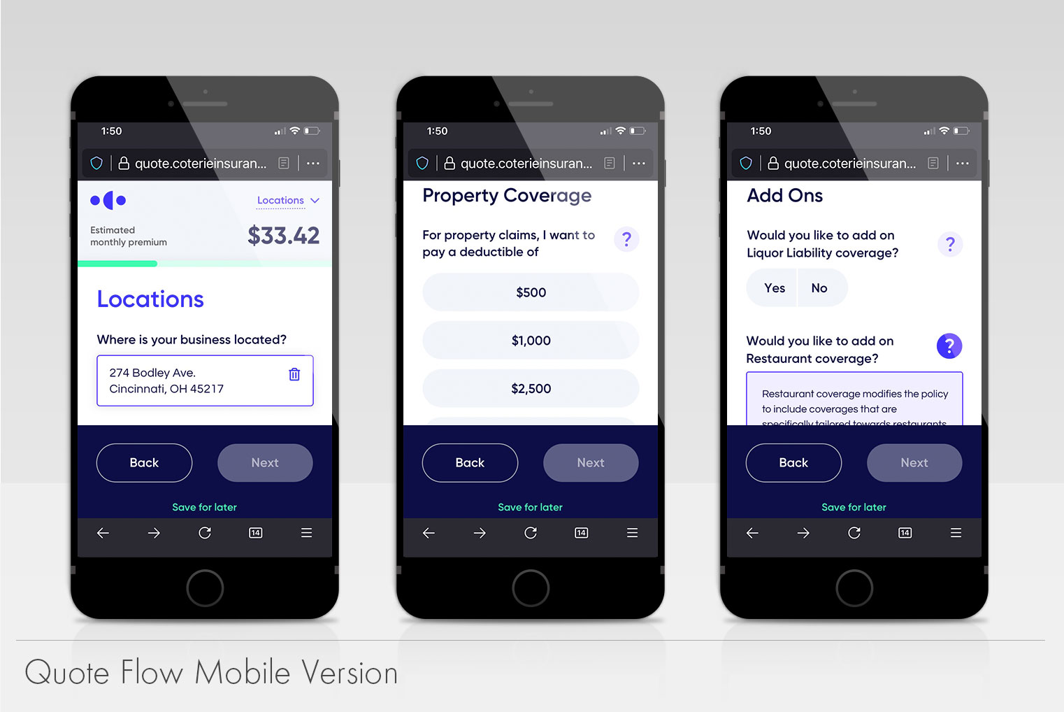
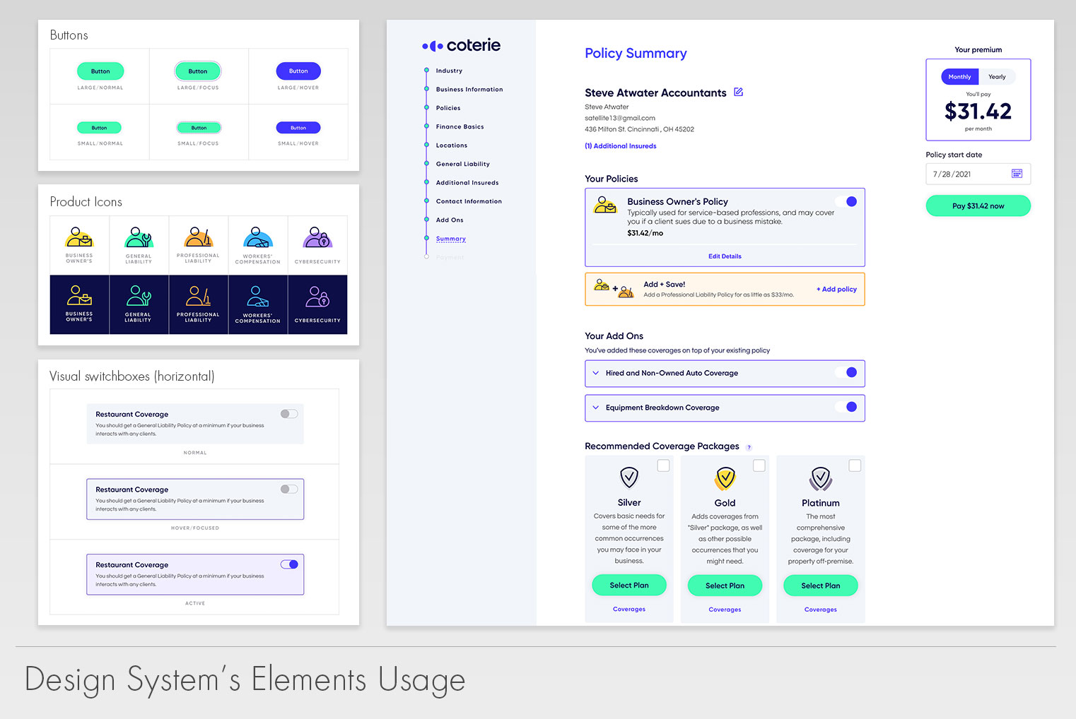
Now a days, Quote Flow is not only visually superior to its predecessor, but we have built it with the ability to scale up as the company increases its insurance offerings. The usage of our design system allows us to maintain consistency while decreasing the amount of production time. This redesign helped us spun out a white label version which was an idea that was born from some partners requests to be able to embed Quote Flow into their websites. We have gotten it to point where we can stand up a version that uses our back-end but visually it uses our partner’s branding while maintaining its general tone and feel.
