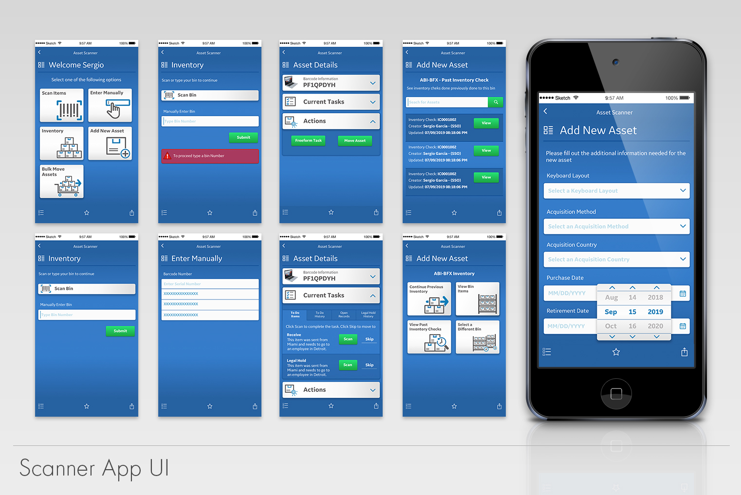
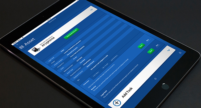
ServiceNow Mobile Scanner App
The scanner app is a web-based application built around ServiceNow. This app came to be due to necessity of our technology/asset depots to know inventory stock levels and to have accurate data in ServiceNow. The company was losing money by not knowing where our assets were and how many we truly had. ServiceNow already provided a very simple platform for us to create this application.
Everything needed was already built in, we just had to figure
out how we could deliver value for our teams. Before we started building it, we had to understand how it was going be used.
For this, we sent some of our engineers to visit our fulfillment depots across the globe. As a team we discovered that these were not in the most optimal shape. In many cases, they were disorganized and lacked the space and technology needed to fulfill their duties.
A very important discovery was the lack of technology.
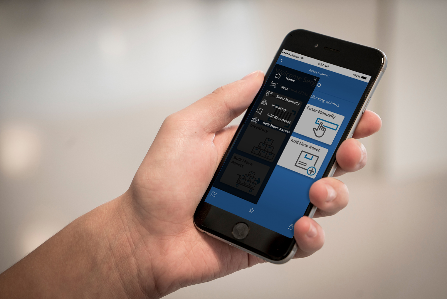
They were using outdated iPod touch and iPads for
scanning the assets on their location. These were not the most optimal devices to get the job done. We didn’t have the ability to change that, however we could adapt our designs to their technology. This is why I focused our design on how it would operate on an iPod touch’s screen.
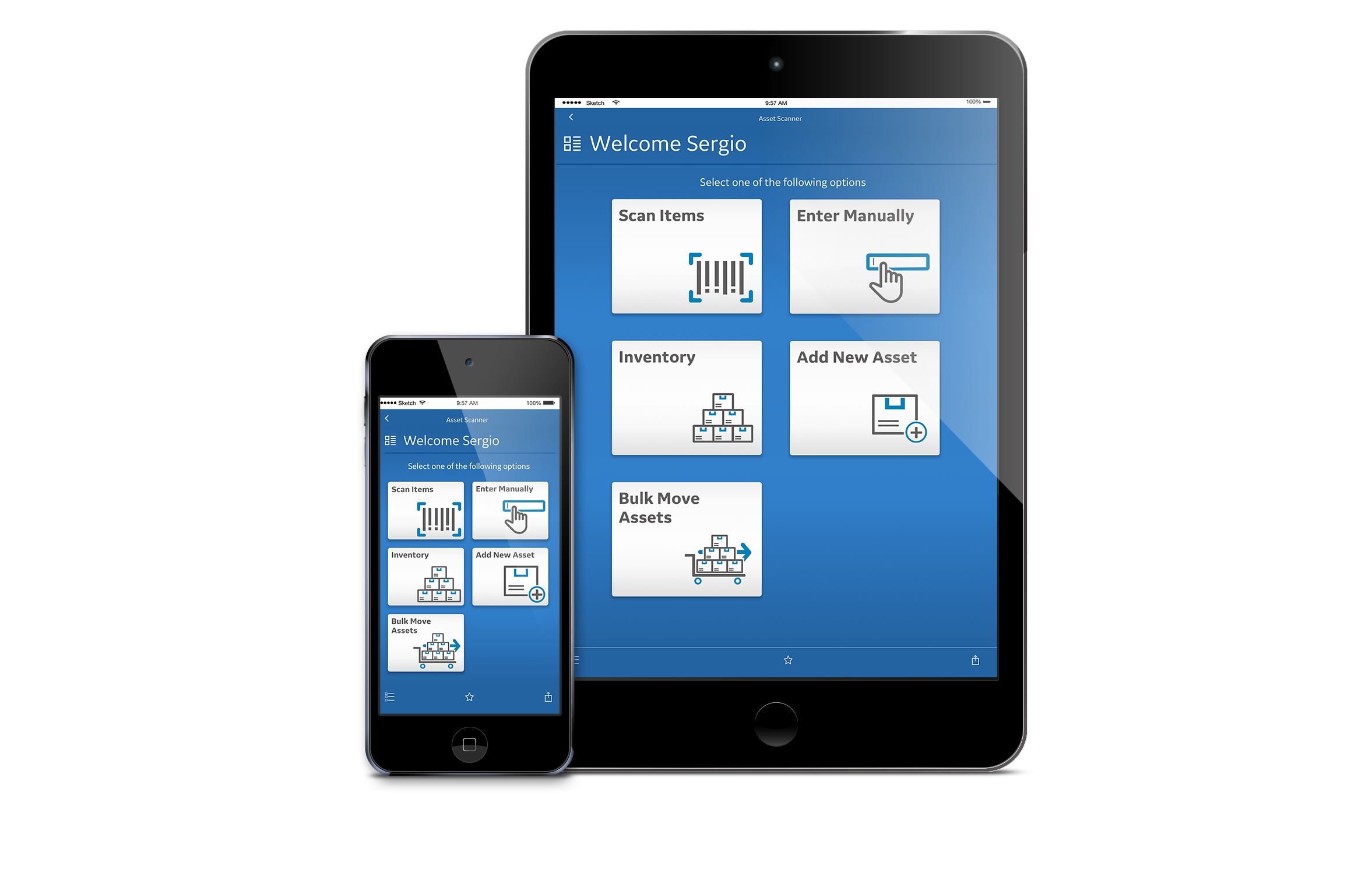
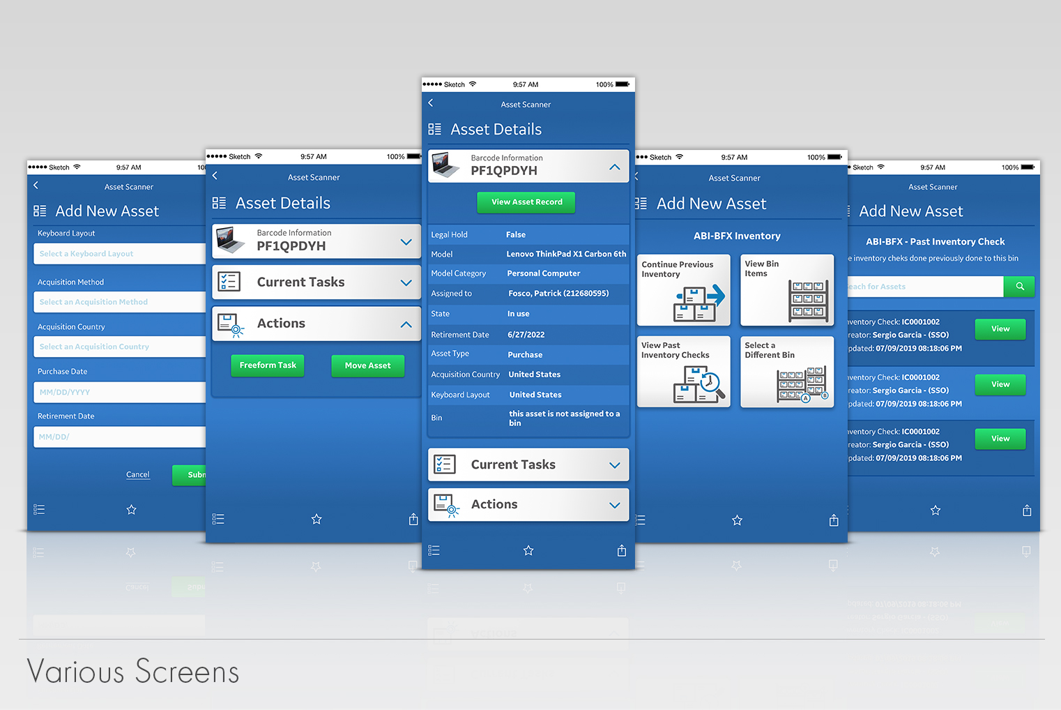
We developed the flow and features of the app based on direct feedback from our depot employees. We wanted to make it as simple as possible. Ideally, we wanted them to
be able fulfill their task by using their thumb. This would
allow them to hold the package with one hand and
the scanning device with the other. With that in mind,
we made our decisions for font sizes, buttons and colors.
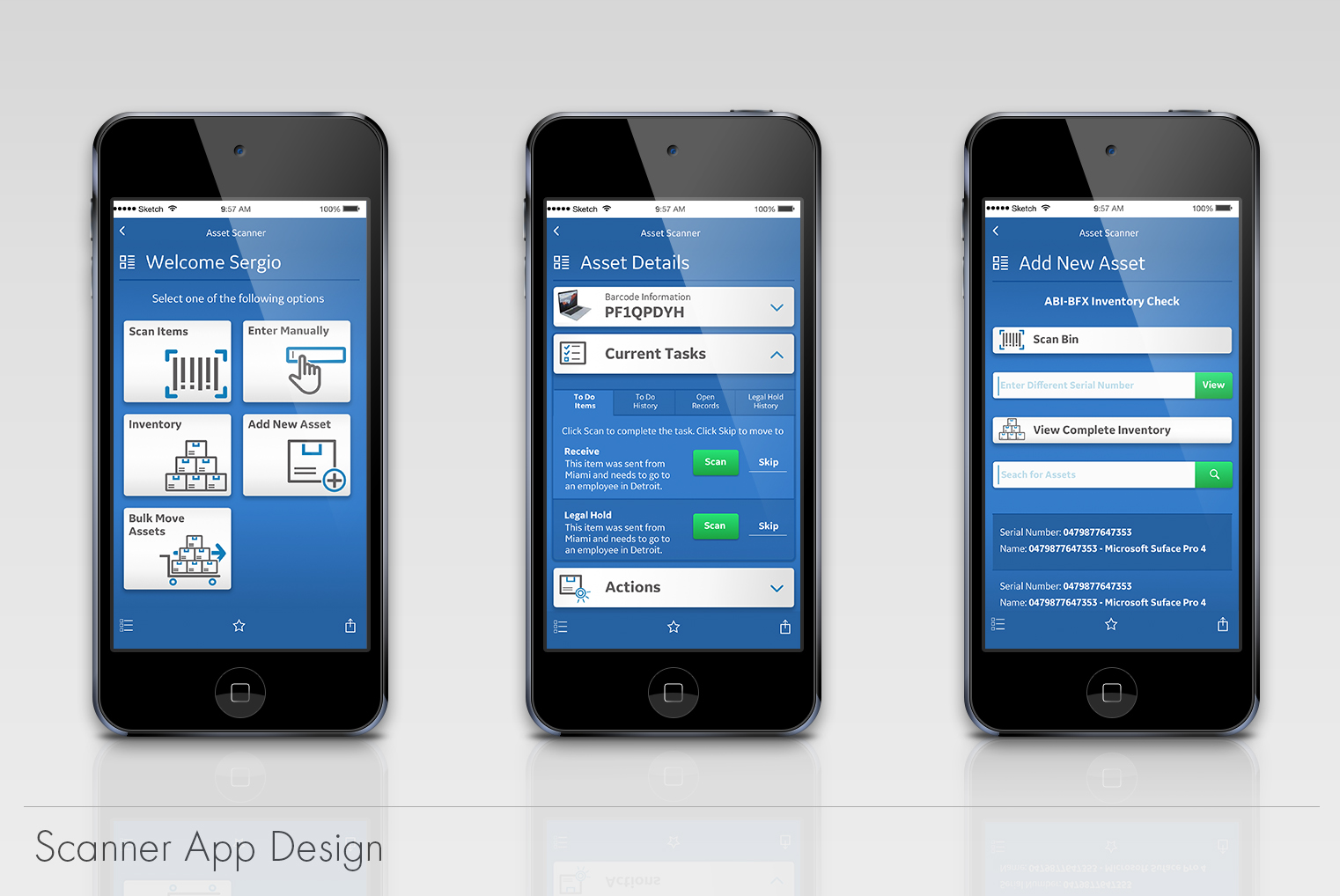
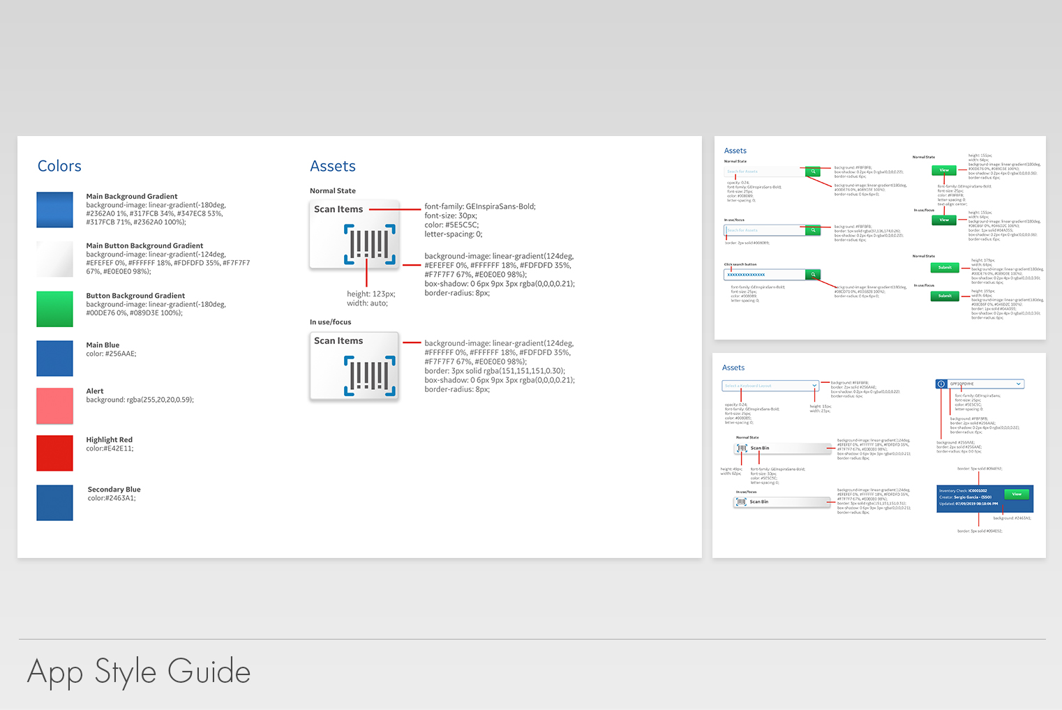
It is worth noting that as we were building the app, we
discovered that natively, it had two blue bars (one at the top and one at the bottom). Our developers felt it would take too much effort to change or remove the bars. To solve this
minor issue, I decided to adapt the design to make them as seamless as possible hence the blue gradient background.
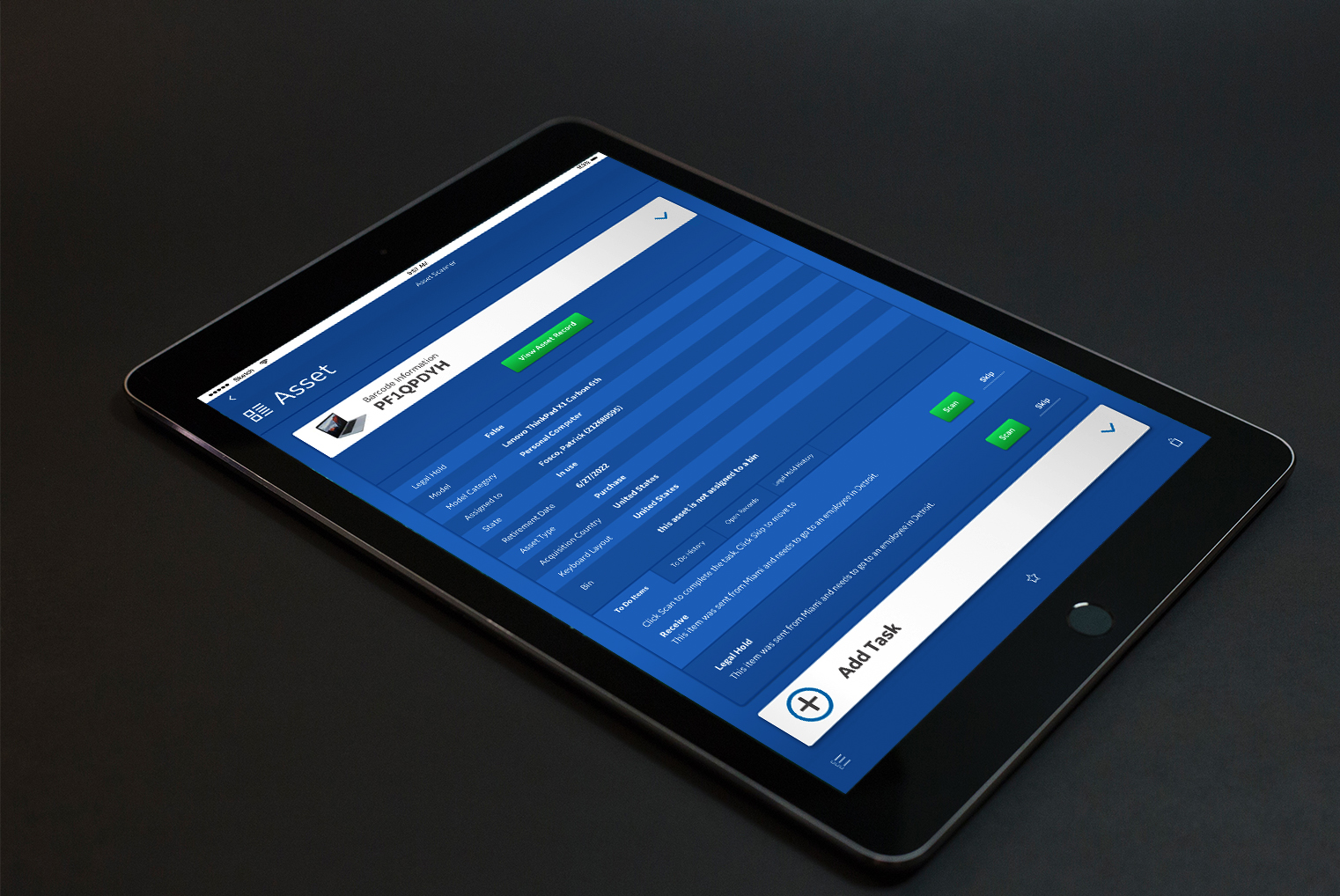
Our users helped us develop an iconography that was easy to understand. We had users that English is not their first
language, so it was imperative to make icons that properly represented the actions they could take.
We gave GE a new way to improve its asset tracking and inventory. We provided the depot managers a faster way to add assets to the database and have a source of truth of what is in stock. The depot wouldn’t have to manually
enter the data, which in return would increase the speed
and accuracy of the depot workers.
Unfortunately, there isn’t exact data to compare how things were prior to introducing the app. To this day we are still working on new features
and keep working with the feedback that our users provide
us with. Overall, this small app has provided great cost benefit for the company.